 >
>
Best Brand Identity
Best Visual Identity
Robilant Associati Spa
Global
JTI Corporate: One JTI - more human, more contemporary, more us.
Entrant
Robilant Associati Spa
Category
Best Brand Identity - Best Visual Identity
Area / Locality
Global
Featured Platforms
Gallery

About
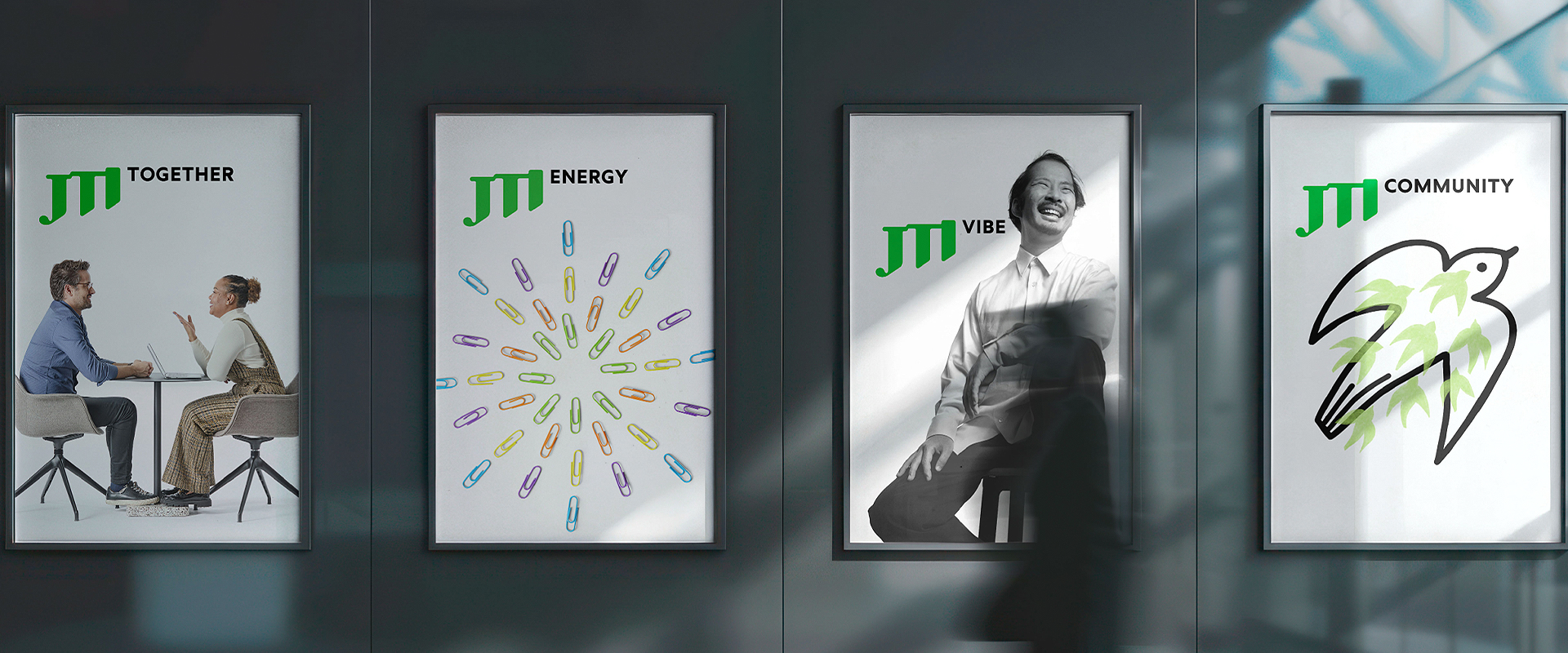
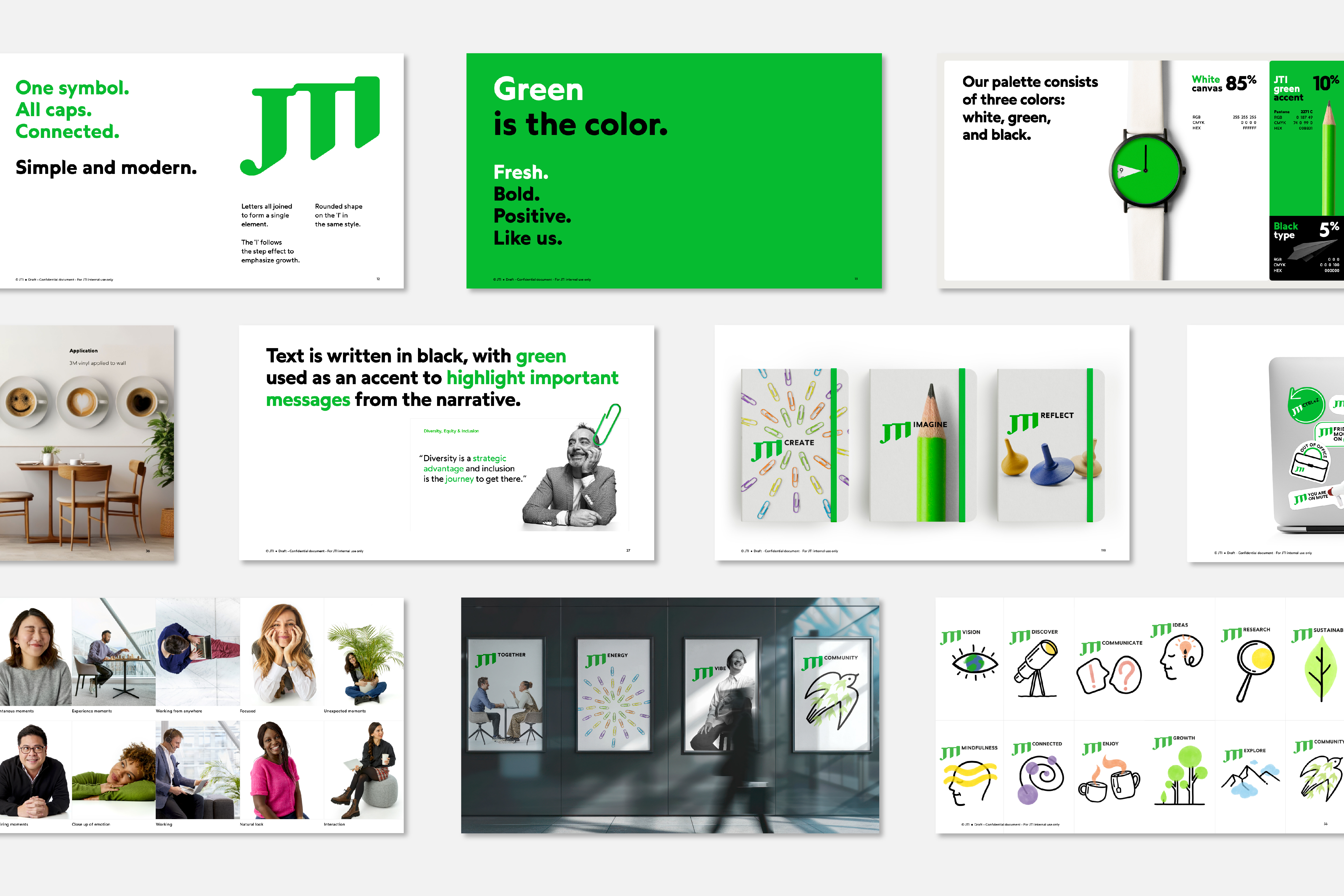
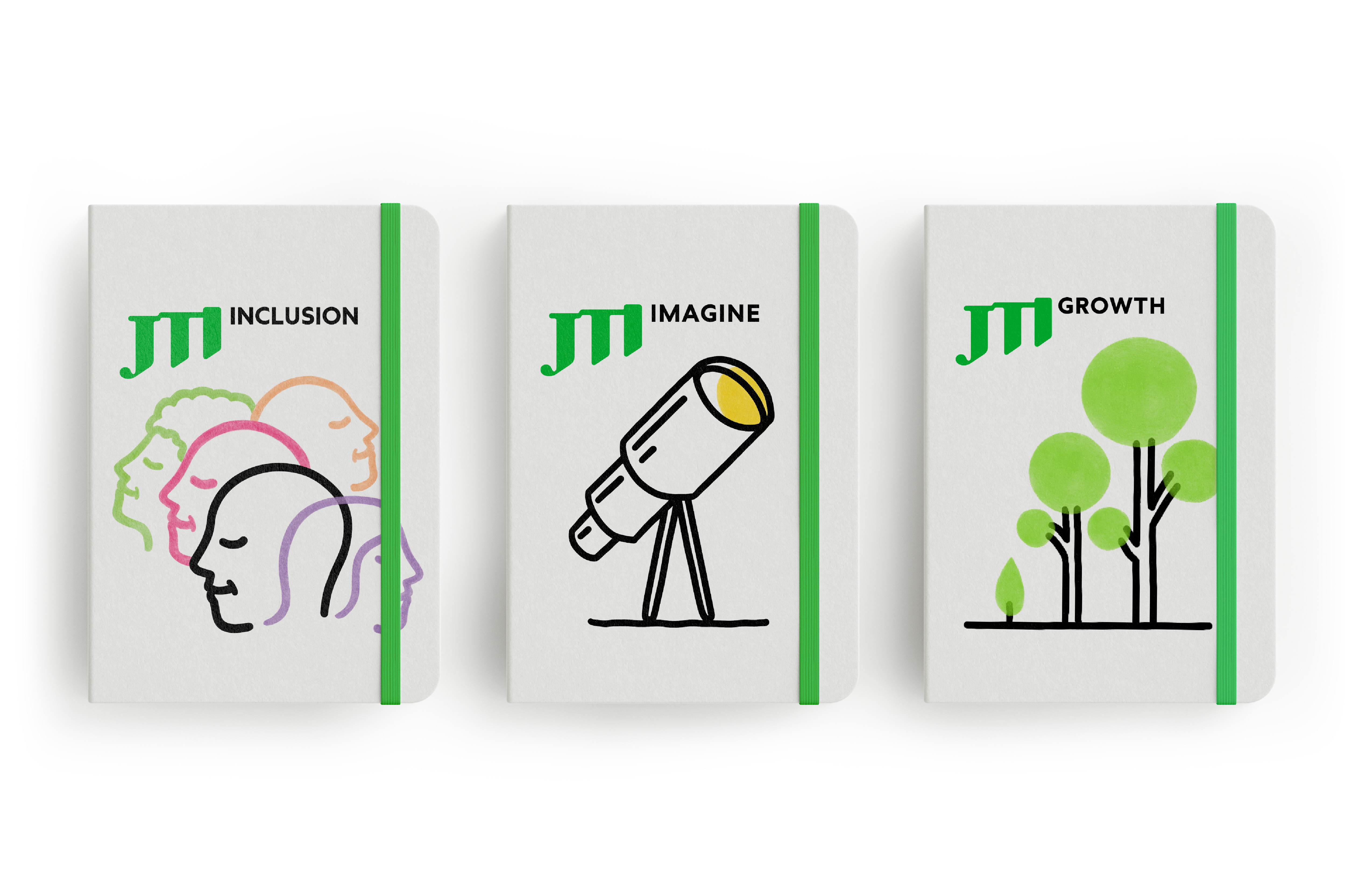
In 2024, JTI set out on a journey to change how it presents itself to the world. This wasn’t just a design exercise to come up with a new corporate identity. It was a moment to step back, look at who JTI is today and express it with clarity and purpose. JTI is a global company operating in a complex, fast moving industry. Our goal was to strengthen the corporate reputation, increase awareness and deepen employee belonging. For many years, JTI’s visual and verbal expressions were very diverse, which was the testament of a culture that values freedom of choice. But as the company and its strategic direction evolved,it became clear that having many different voices made it harder to express what JTI stands for (internally and externally).The work began by going back to the basics of our heritage,our culture and JTI’s essence of People centricity & Growth. This became the foundation for everything; A new design system was created:modern, bold, and forward looking, yet still unmistakably JTI.
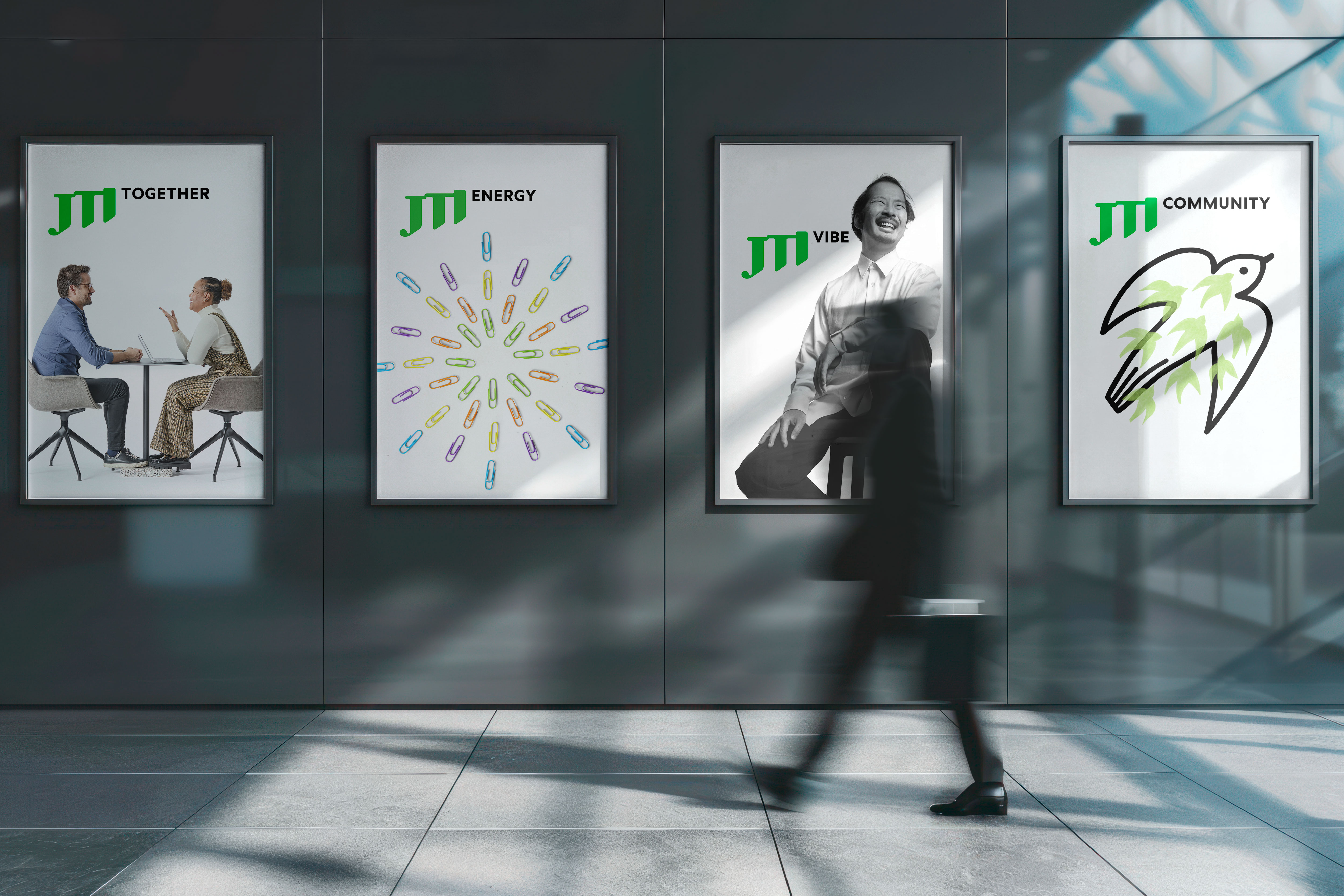
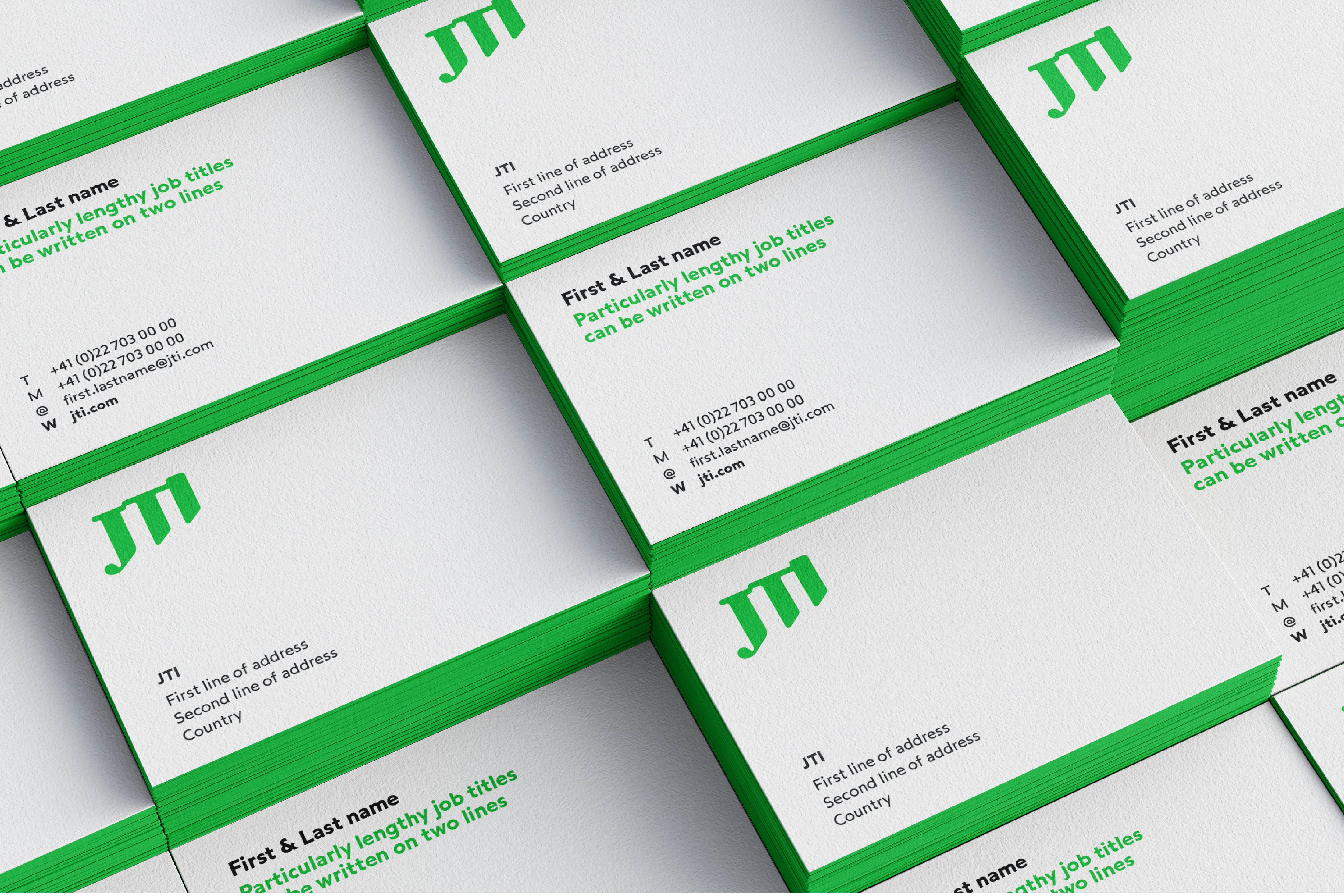
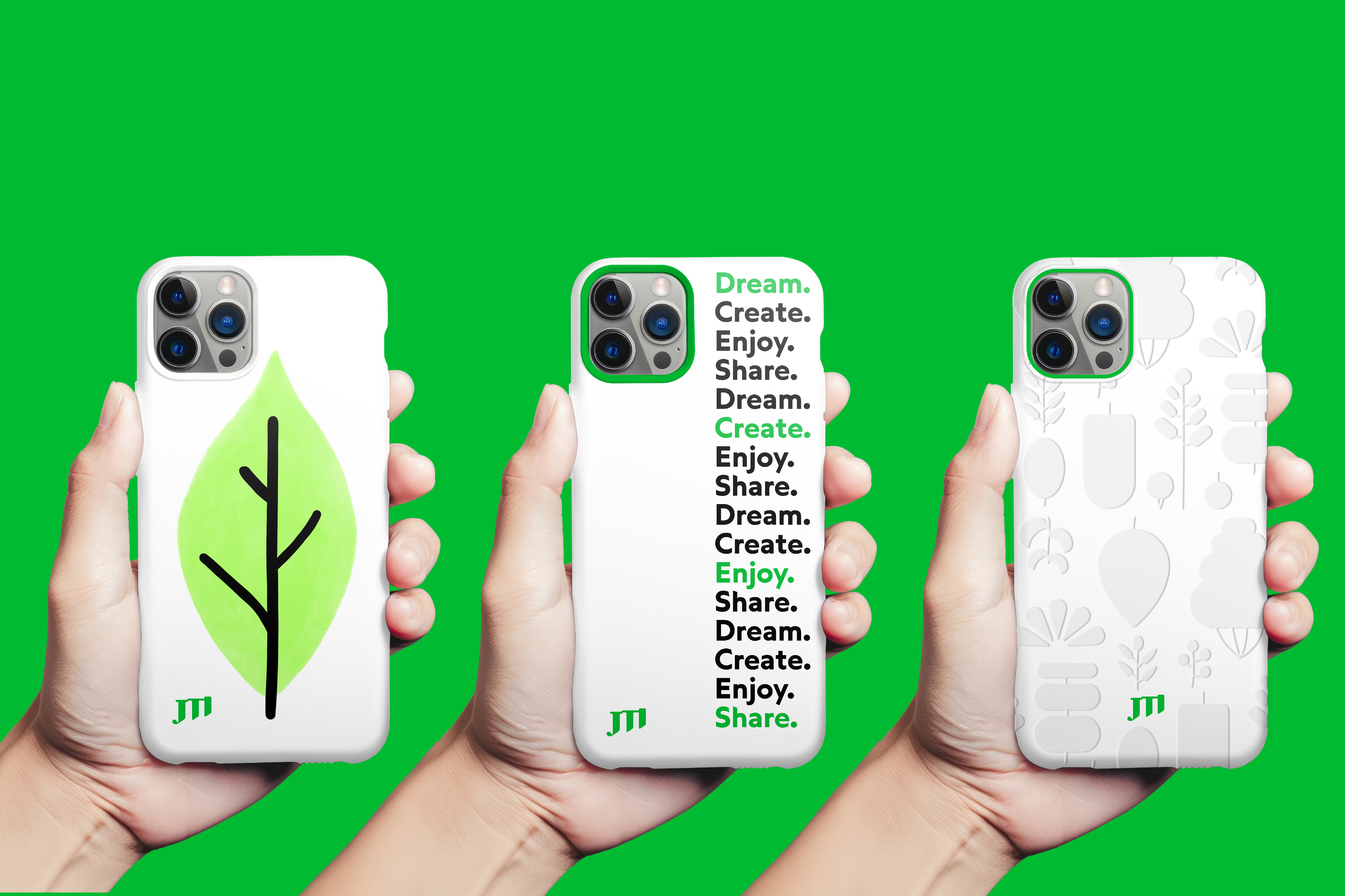
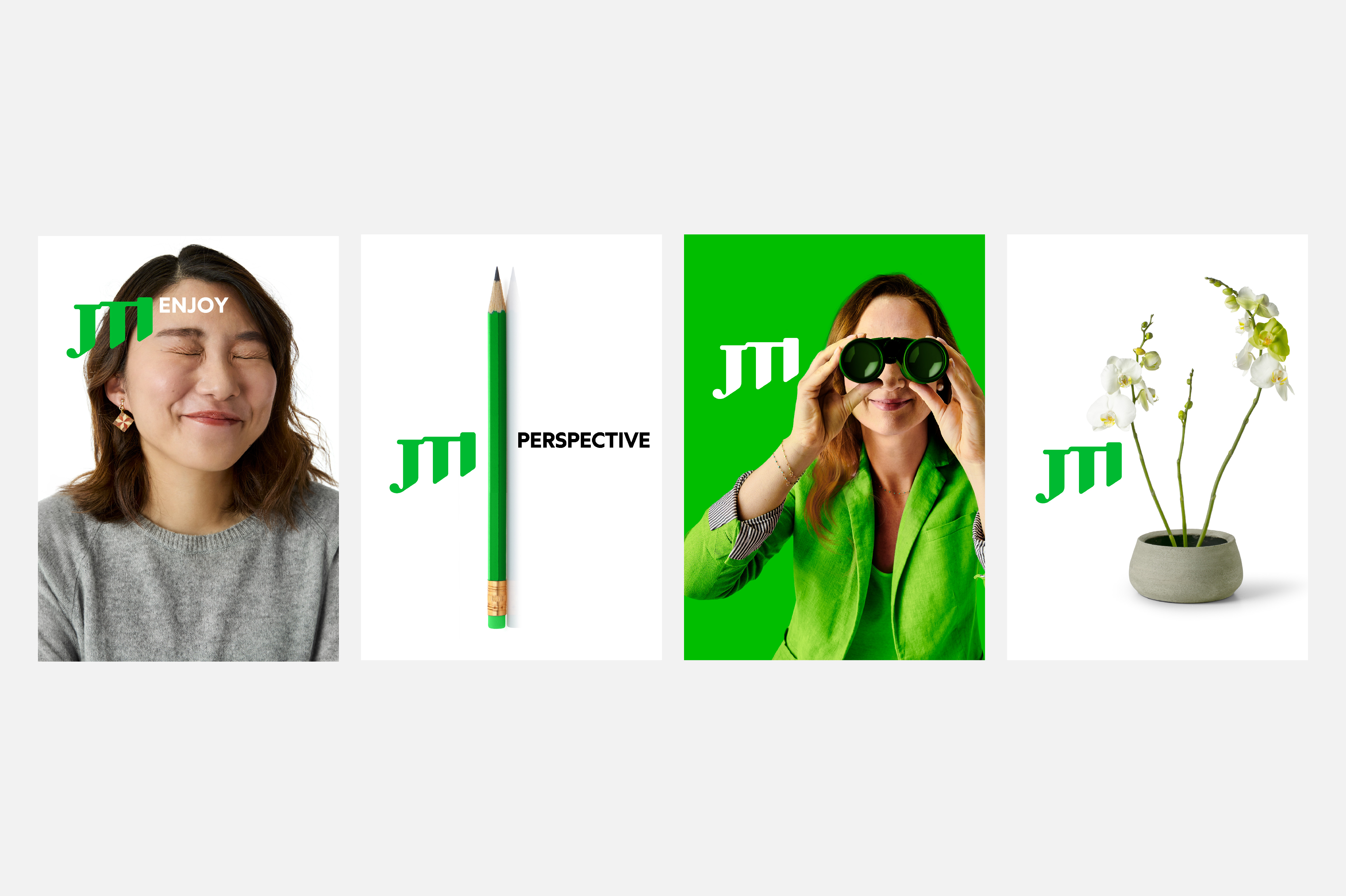
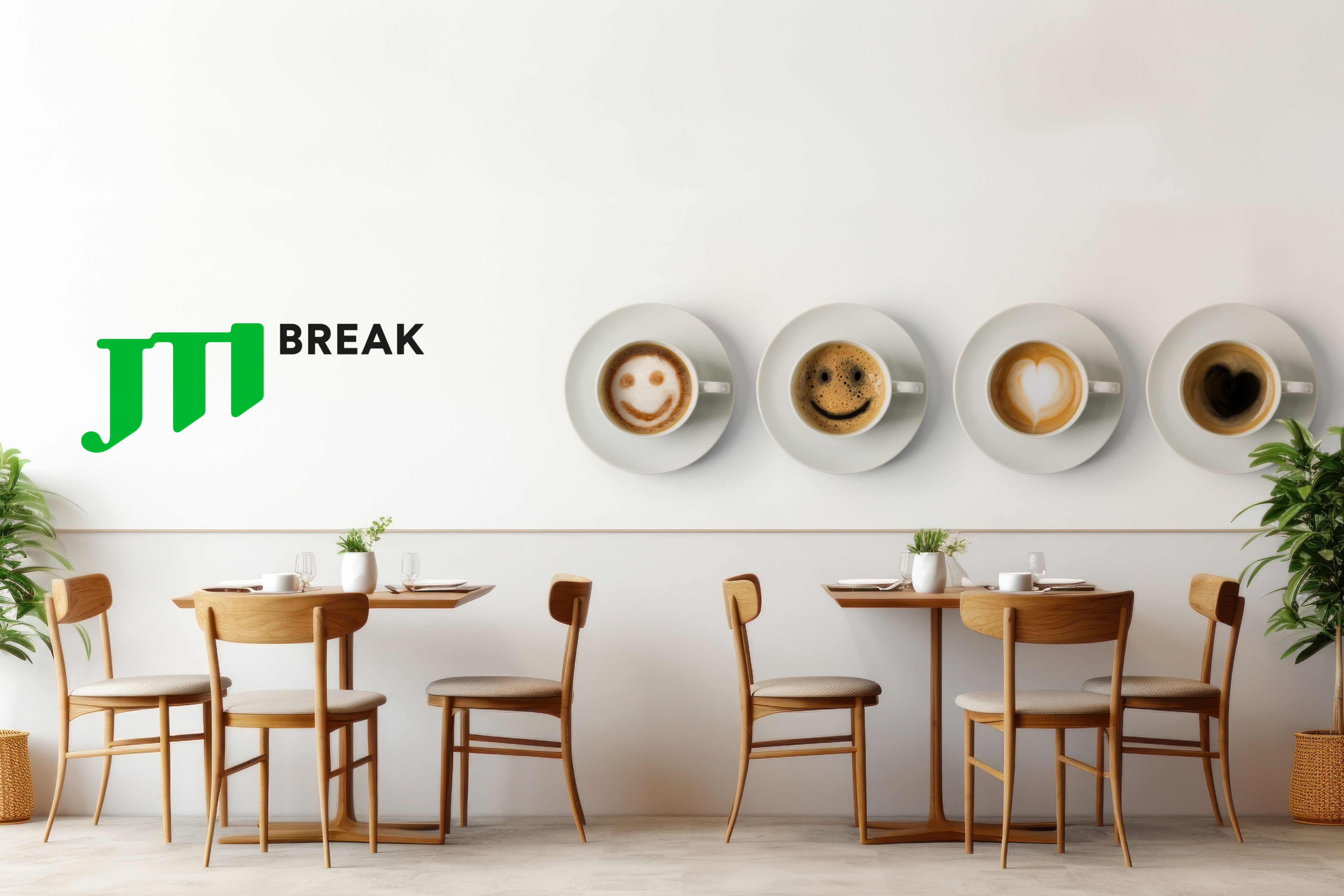
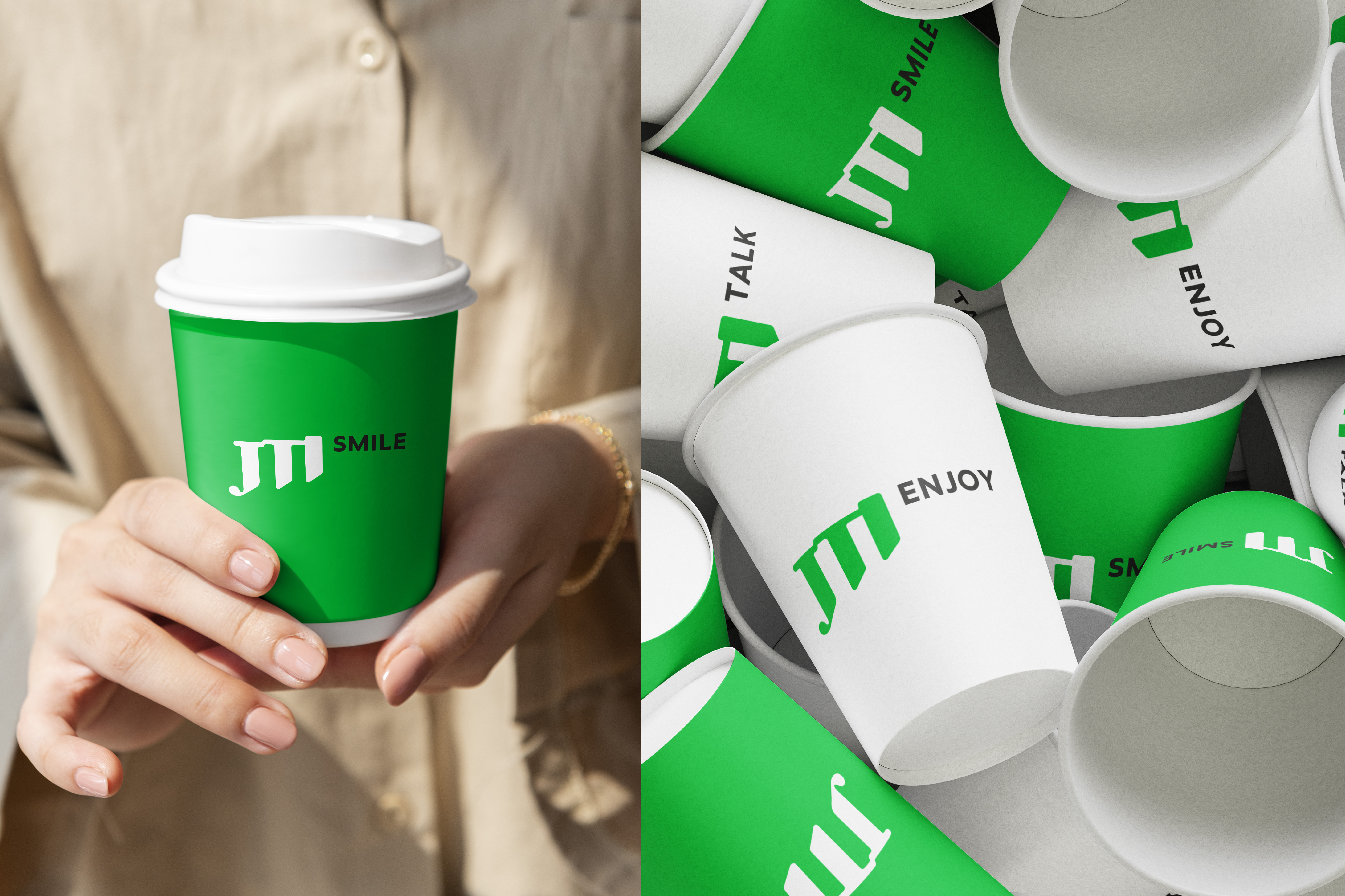
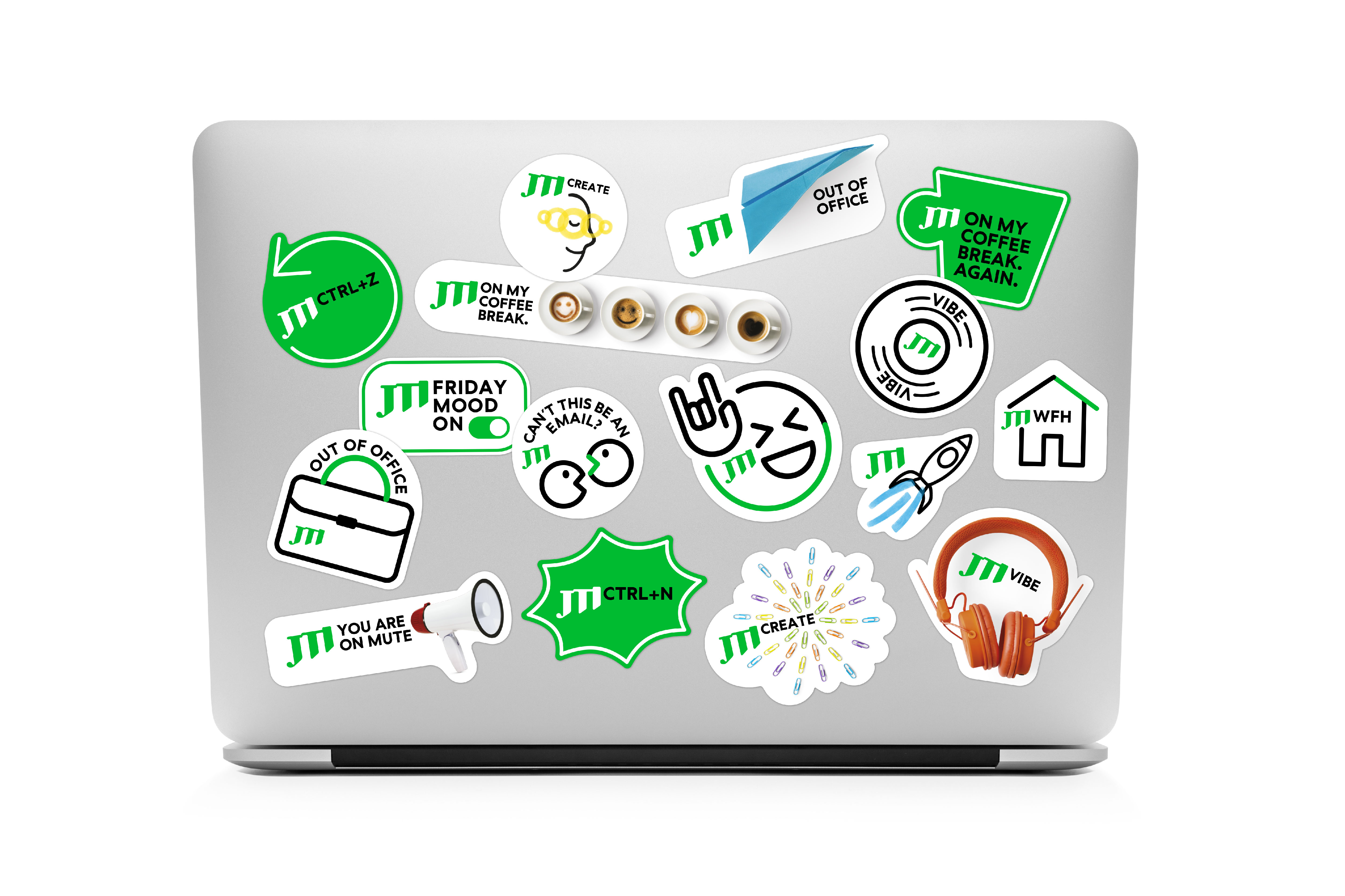
The starting point was the logo. Historically linked to the JT (mother company) logo, it symbolizes the Japanese concept of Migikataagari - the idea of growth and progress, by rising upward. For the 1st time in the company’s history, the three separate letters that were meant to be the initials of the company name, were redesigned into a single, unified symbol that had a hidden, relevant meaning. The new logo respects JTI’s heritage while bringing it confidently into the future. Color also played a transformative role. JTI’s signature green became brighter and more distinctive, a refreshing contrast in a sector dominated by blue. This green expresses optimism, balance, and a positive outlook - qualities that align with JTI’s purpose and personality.
The new identity is designed to be simple, clean and modern. It reduces visual noise, opens space, and puts the spotlight on JTI’s people. Simplicity and clarity make JTI feel more accessible and connected. This was more than a visual update. It reshaped how JTI shows up as a company: One JTI - more human, more contemporary, more us.
Credits