 >
>
Best Rebranding Effort
Best Cultural Rebranding
J.R. Reingold & Associates, Inc.
United States
Reingold Rebrand
Entrant
J.R. Reingold & Associates, Inc.
Category
Best Rebranding Effort - Best Cultural Rebranding
Area / Locality
United States
Featured Platforms


About
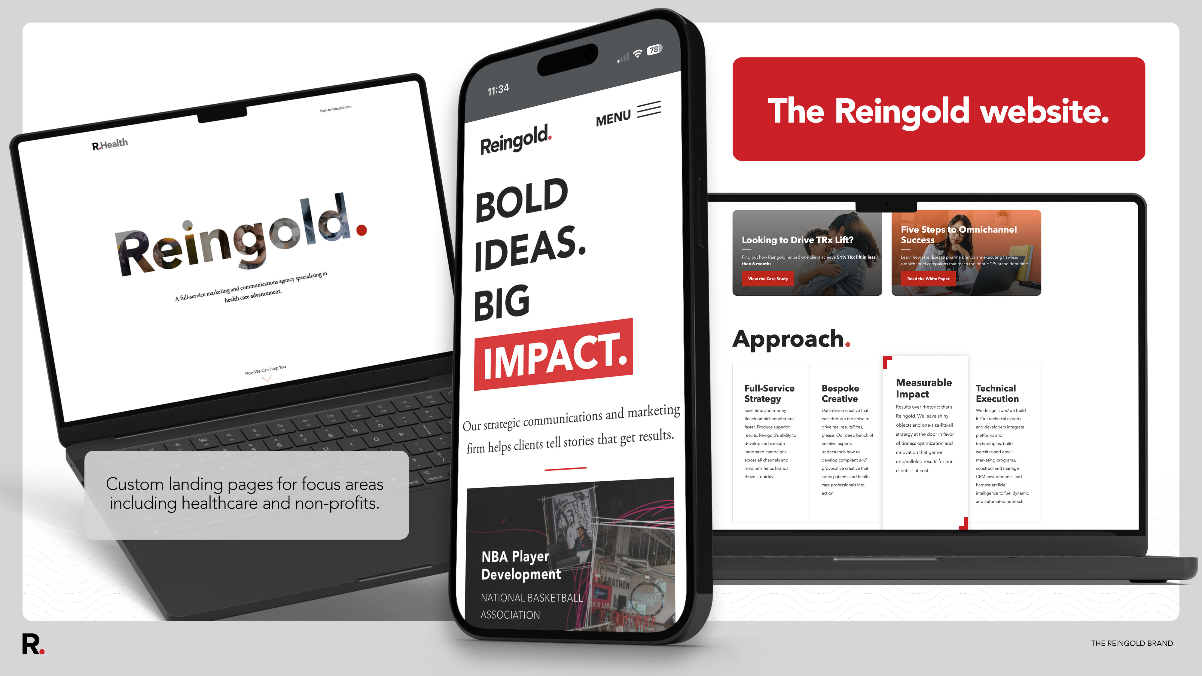
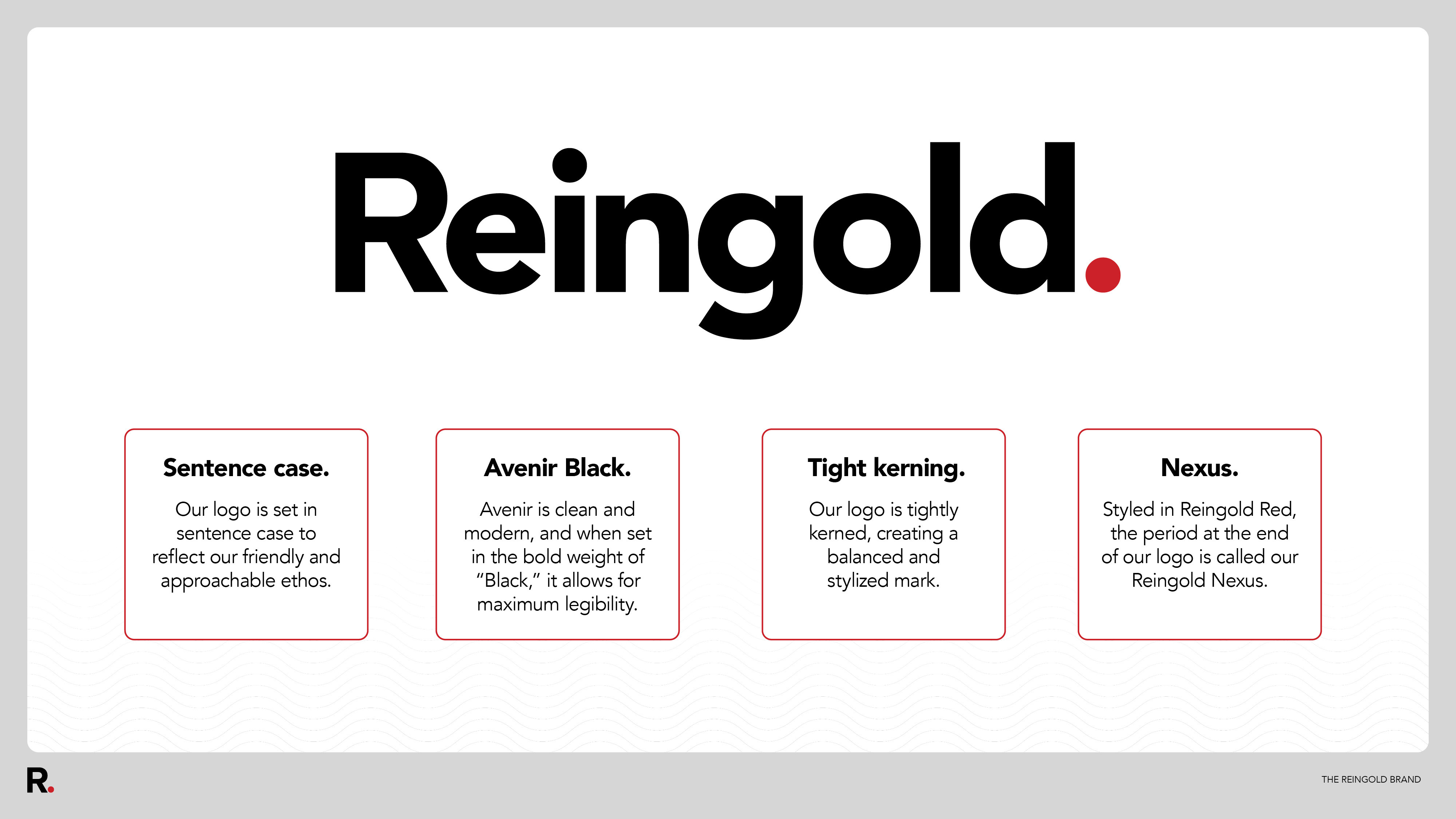
As Reingold approached its 40th anniversary, the milestone prompted a thoughtful evaluation of the brand’s current state and future needs. Over time, the organization’s visual materials had evolved toward a more modern, clean, and intentional design approach, but the primary logo had not progressed at the same pace. This disconnect created inconsistency across touchpoints and limited the brand’s ability to perform effectively in contemporary, competitive environments. The goal of the rebrand was not novelty, but alignment. Reingold needed an identity—beginning with the logo—that reflected the organization’s personality, supported its work across multiple sectors, and reinforced both external credibility and internal culture. The original logo lacked the visual strength and flexibility required for digital platforms, print materials, promotional items, and industry events, and the shorthand “R” did not function as a strong or recognizable symbol. Rather than rebuilding the brand from scratch, the team focused on reimagining the logo and strengthening the broader visual system. This approach preserved recent brand progress while introducing intentional updates that better reflected Reingold’s role as a strategic communications partner working across public service and commercial spaces. The updated wordmark builds on Reingold’s established Avenir typeface, selected for its modern, approachable qualities. Transitioning from all caps to title case—with a capital “R” followed by lowercase letters—softened the tone, creating a more human and collaborative presence while improving legibility. A bold weight increased visual impact across applications. A defining feature of the new identity is the red period at the end of the wordmark, referred to internally as “the Nexus.” This element anchors the logo visually and conceptually, symbolizing the point where ideas connect and momentum is created—mirroring Reingold’s role in aligning insight, creativity, and execution. The Nexus also allows Reingold red to remain central to the brand while being used with greater restraint. Supporting elements, including a refined color palette and updated framing devices, further strengthened cohesion and adaptability across sectors. Together, these decisions resulted in a modern, flexible identity that honors Reingold’s legacy while positioning the brand with clarity and confidence for what comes next.
Credits