 >
>
Best Brand Design
Best Logo Design
Zhao Minru
China
Zhao Minru
Entrant
Zhao Minru
Category
Best Brand Design - Best Logo Design
Area / Locality
China
Featured Platforms
About
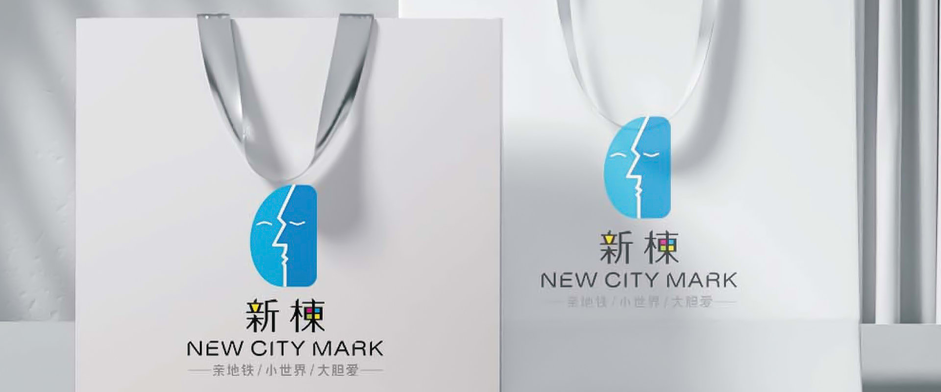
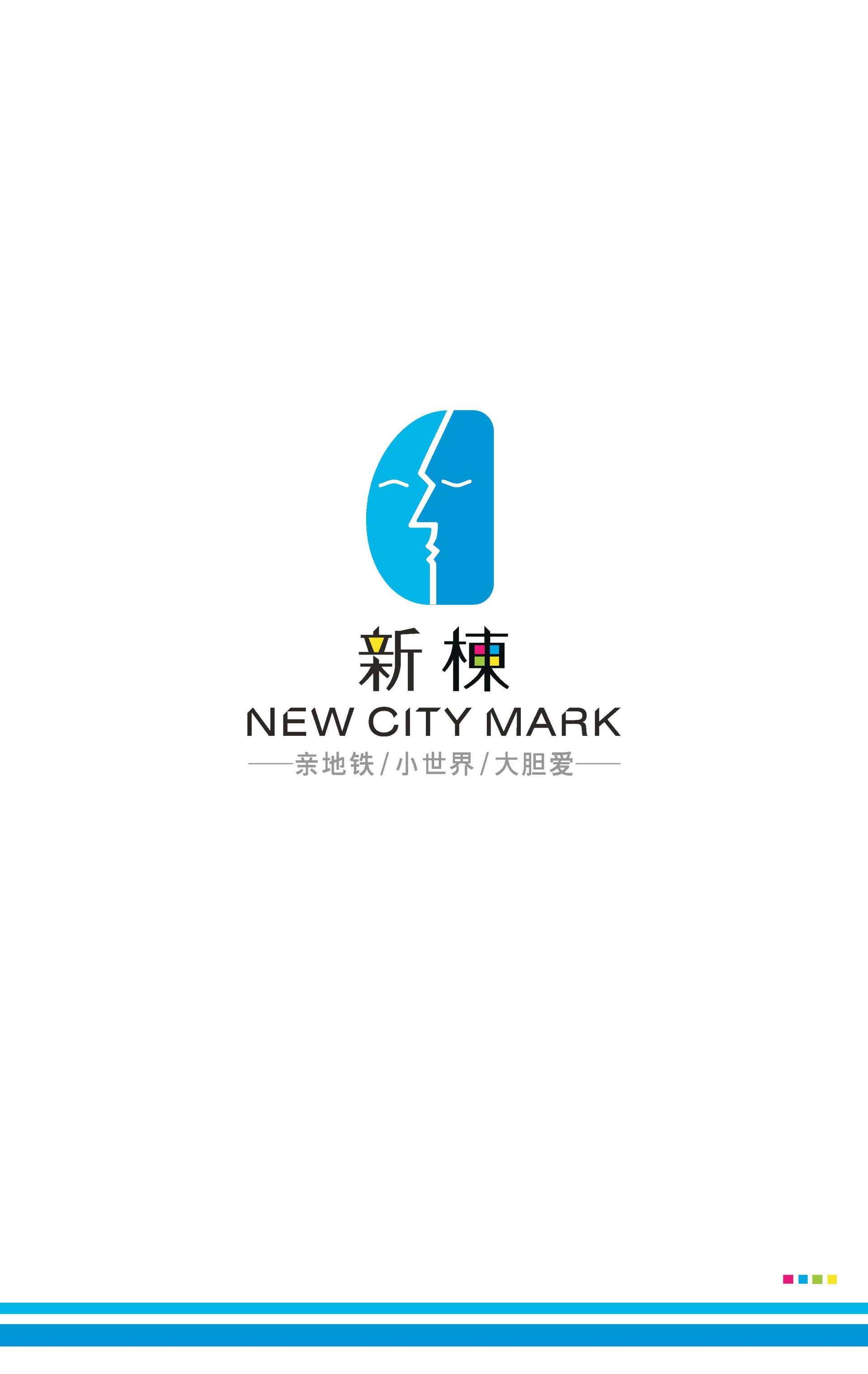
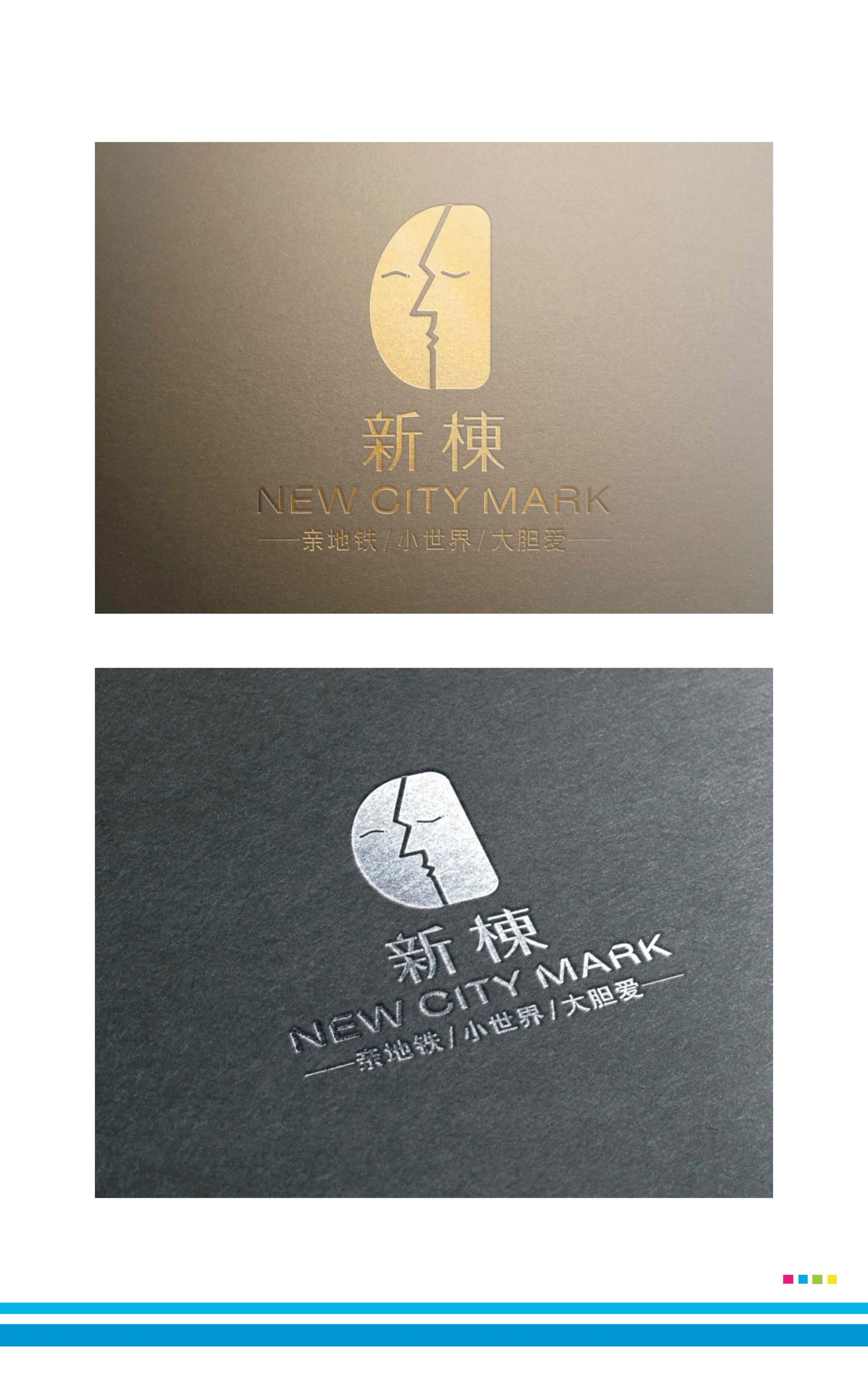
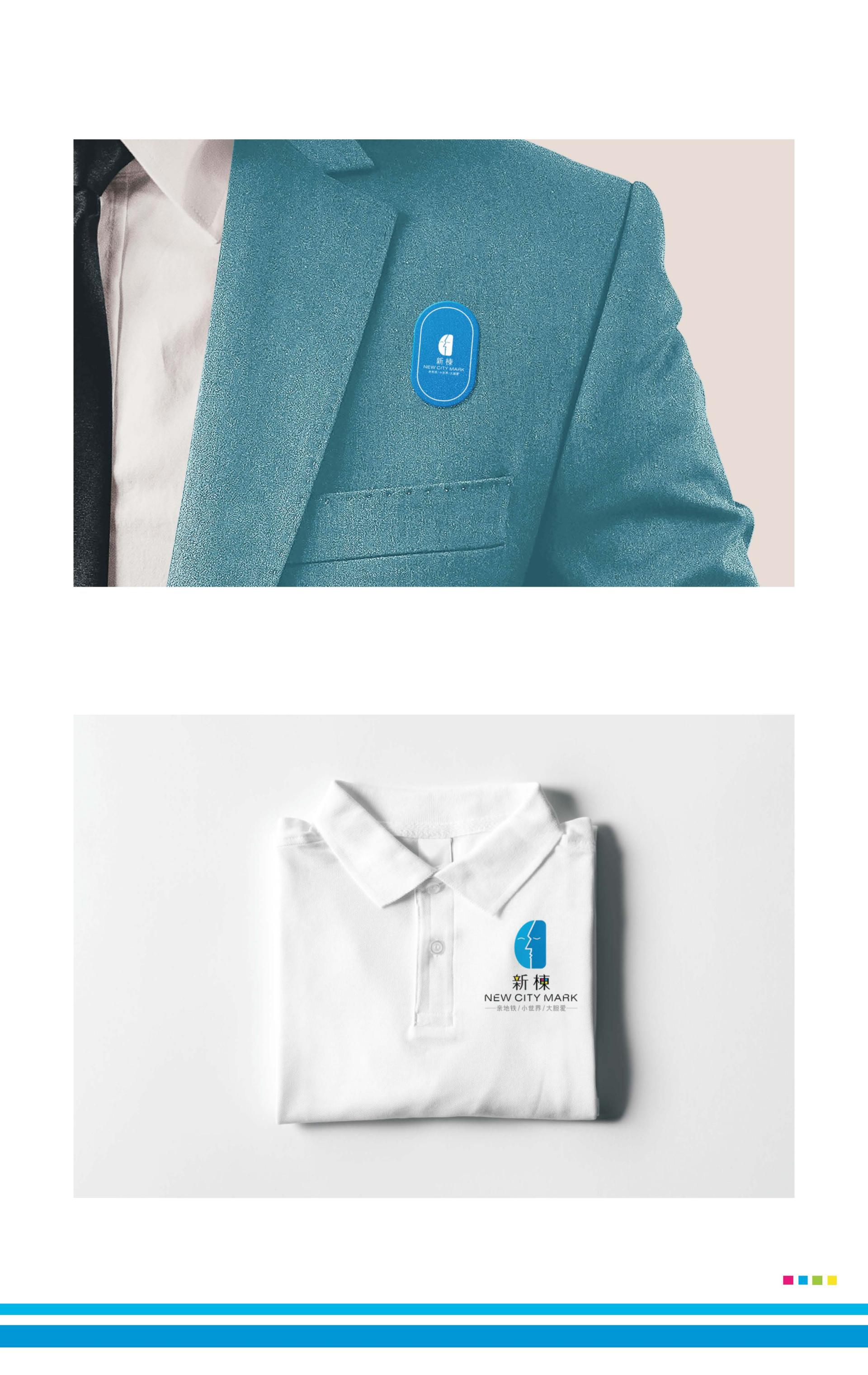
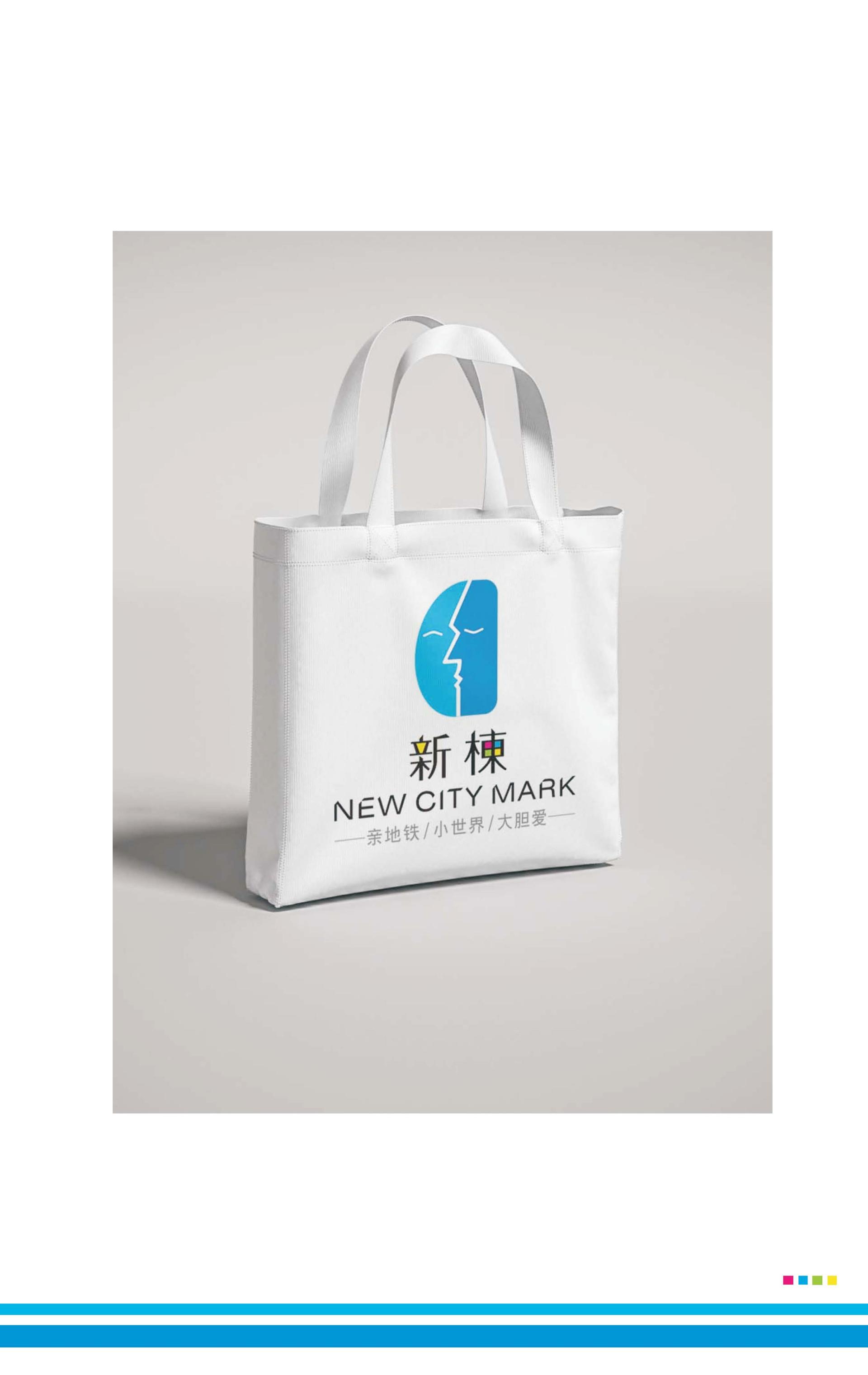
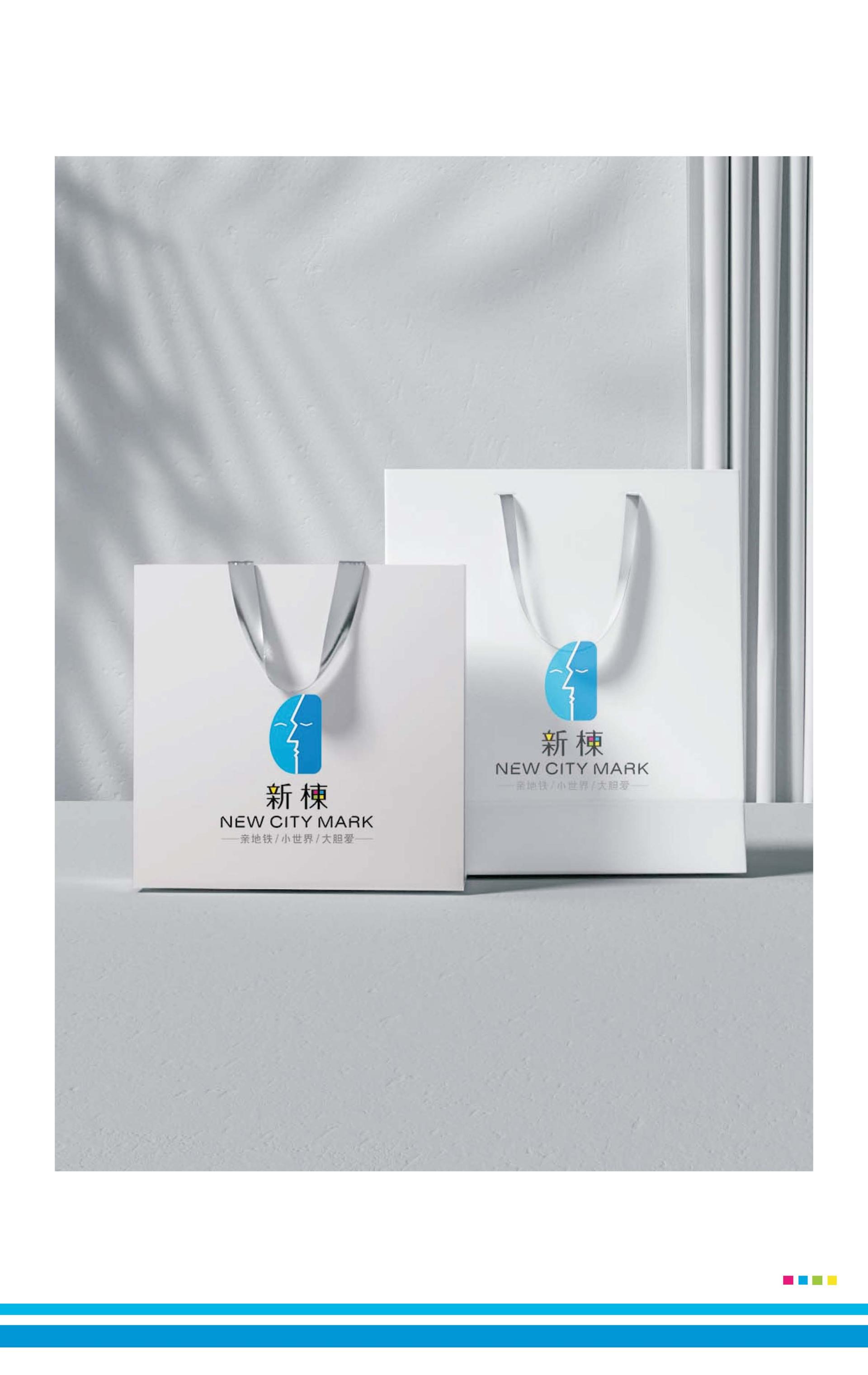
The emblem is built around two mirrored, blue-profile silhouettes. A light-blue gradient on the left conveys softness and inclusiveness, while a deep-sea blue on the right stands for steadiness and reliability—an echo of how newly-weds complement and complete each other. Clean, minimal facial lines show eyes gently closed for serenity and a subtle upturned smile for happiness. The thin white negative space between the profiles forms both a window and a bridge, hinting at the “small world” of private intimacy that the brand protects.
In the Chinese logotype “新棟”, the top of “新” carries a small yellow trian-gle—an abstract roof that signals “home”. Embedded in the right side of “棟” are four tiny squares in red, green, blue and yellow, representing passion, vitality, trust and warmth. The English wording “NEW CITY MARK” is set in a modern sans-serif, while the baseline pay-off “Metro-close / Private world / Dare to love” distills the project’s key promise.
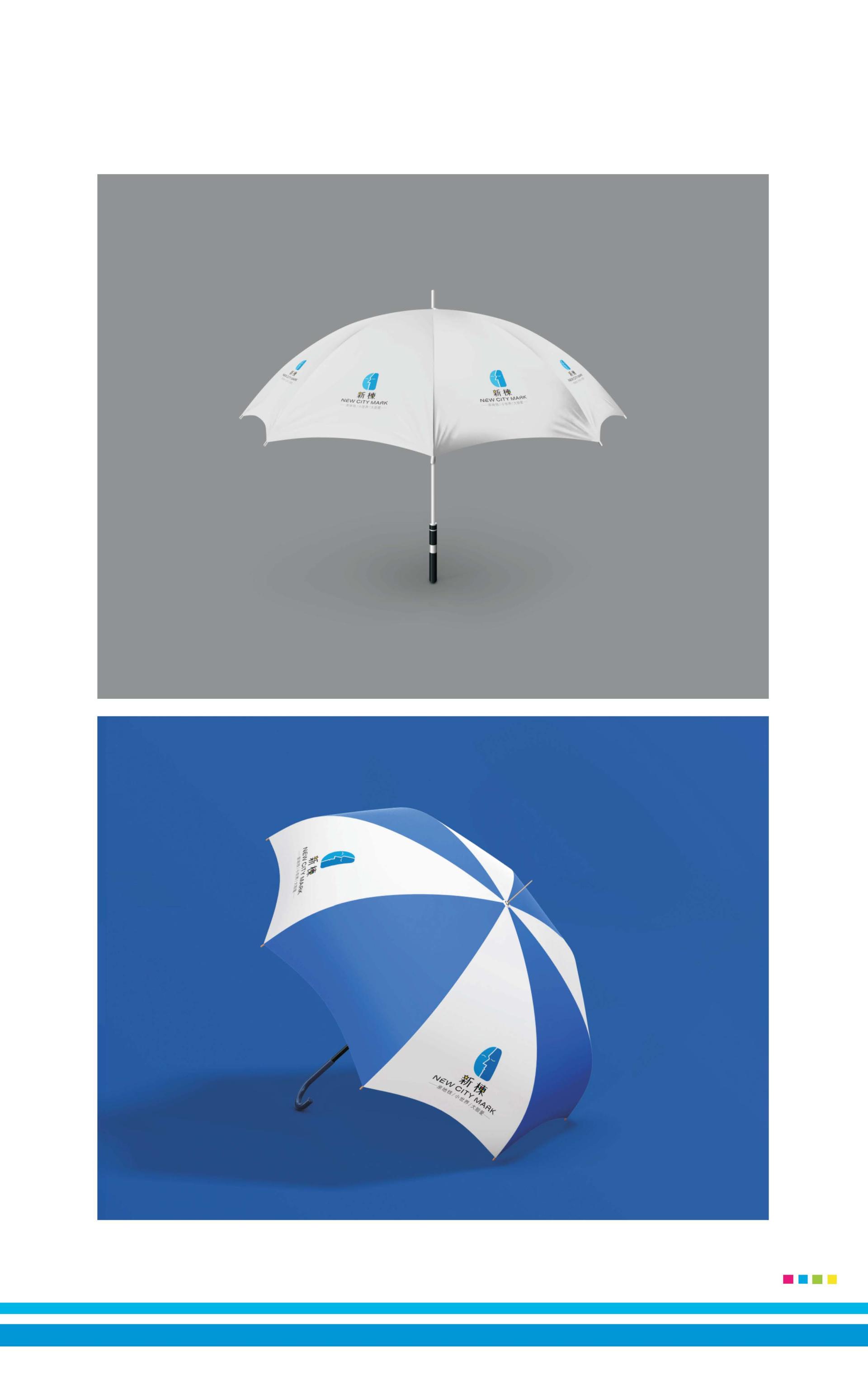
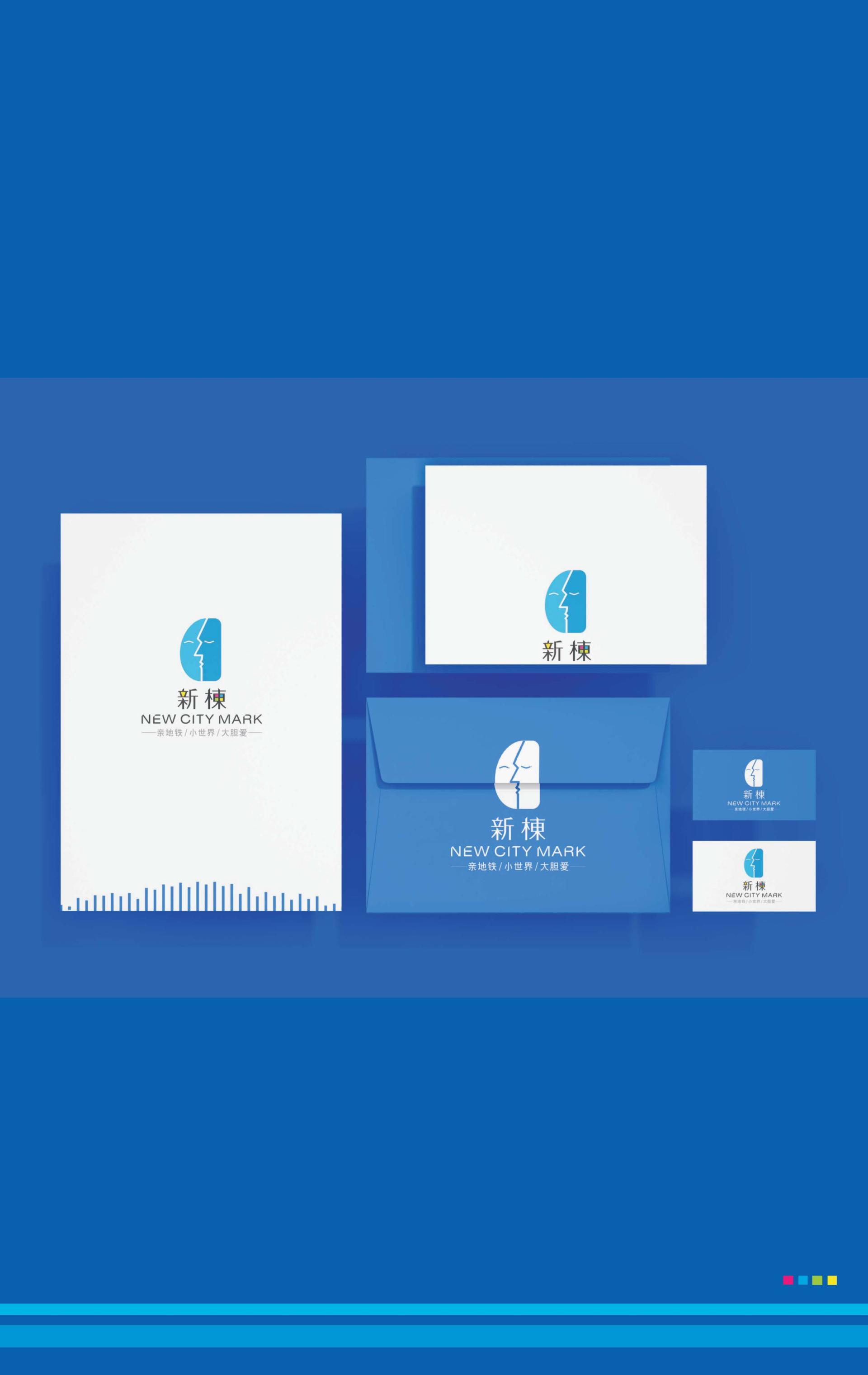
The dominant blue palette communicates professionalism and trust; vivid accent colors inject energy, mirroring the dual rational-emotional nature of new-ly-wed housing. By fusing human and architectural imagery, the mark embodies the brand vision: “an urban harbor with a human touch.”
Credits
