 >
>
Best Rebranding Effort
Best Visual Identity Refresh
City of Phila. operating Philadelphia International(PHL) and Northeast Philadelphia(PNE) Airports
United States
PHL Airport Brand Refresh
Entrant
City of Phila. operating Philadelphia International(PHL) and Northeast Philadelphia(PNE) Airports
Category
Best Rebranding Effort - Best Visual Identity Refresh
Area / Locality
United States
Featured Platforms
Gallery
About
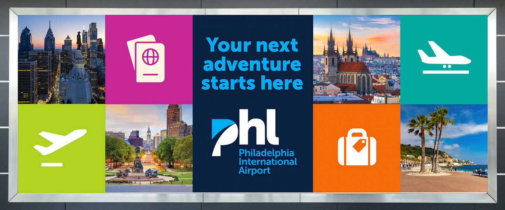
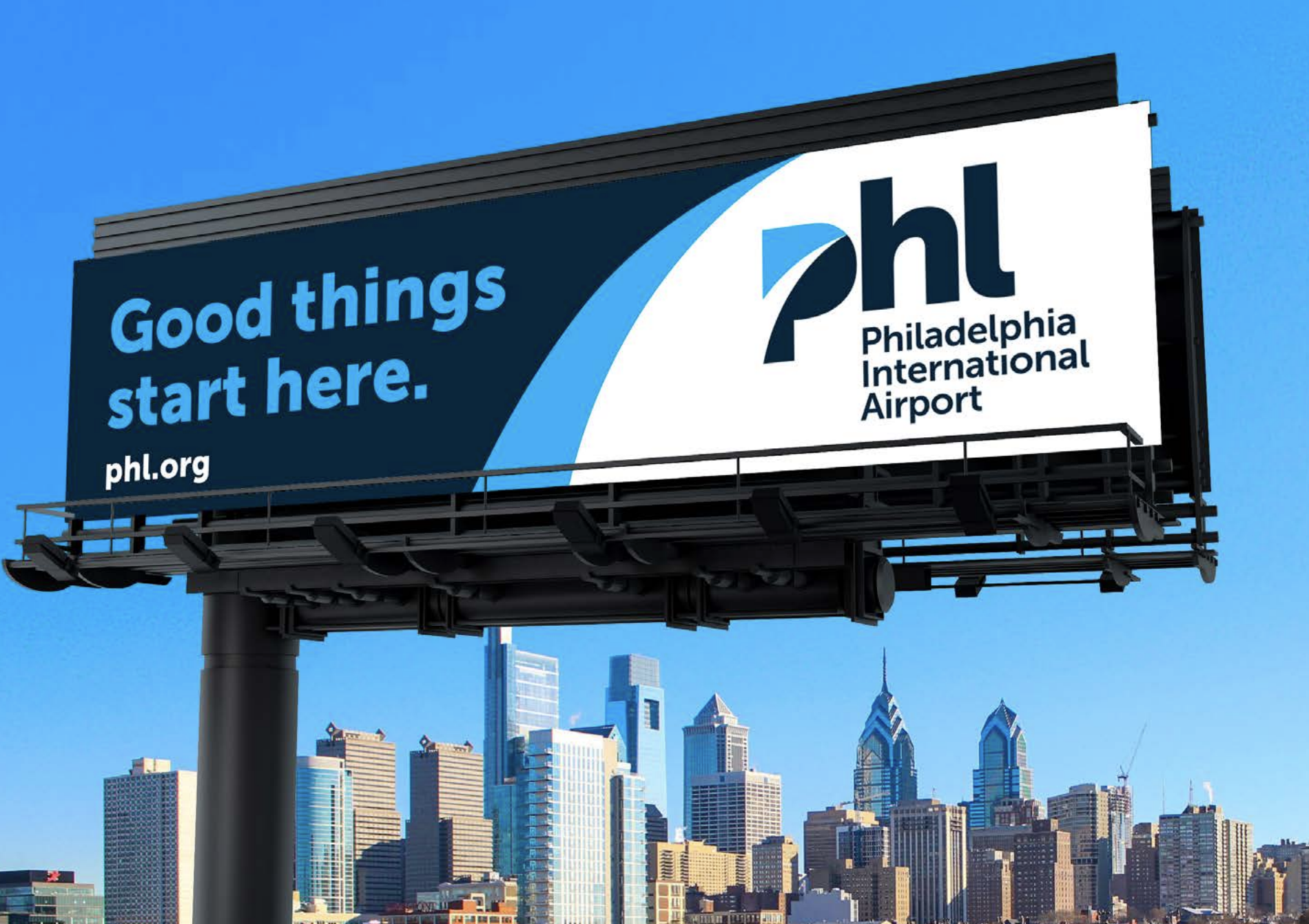
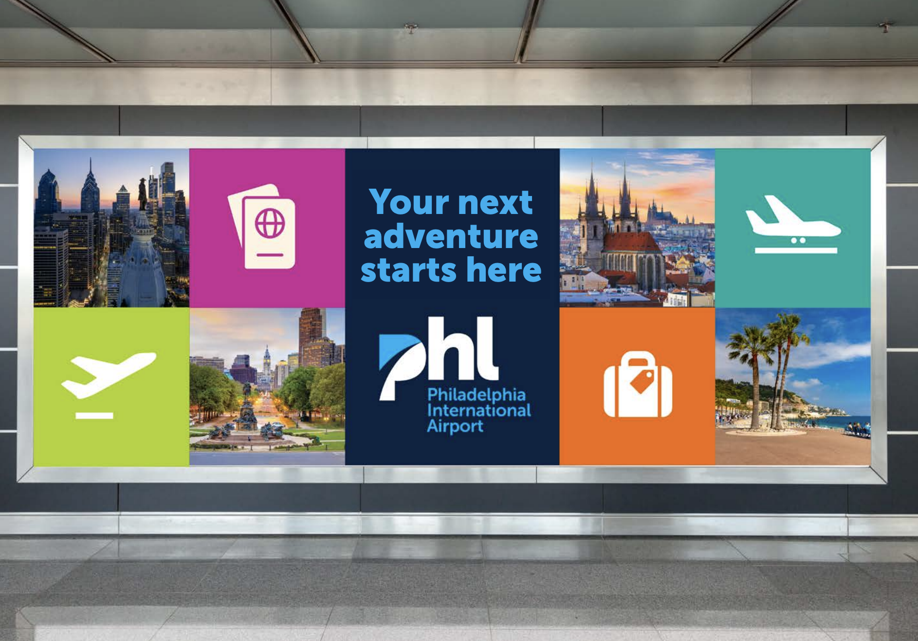
Philadelphia International Airport (PHL) and Philadelphia Northeast Airport (PNE) are more than transportation hubs – they are the front doors to a city that helped shape the nation. As the international gateway to the birthplace of America, PHL is often the first “hello” and the last “see you soon” for millions of travelers each year. This brand refresh was created to ensure that first impression matches what Philadelphia is today: bold, welcoming, and constantly evolving – while still honoring the legacy of an institution deeply woven into the city’s identity.
At the heart of the work is a clear, united brand DNA that aligns how we look, sound, and show up across every touchpoint – from signage and digital experiences to campaigns, wayfinding, and internal communications. The refreshed positioning embraces a “best of both worlds” story: world-class amenities and a vibrant sense of place, paired with the convenience of an easy-to-navigate airport experience. In other words, PHL delivers the scale travelers expect, with the clarity and efficiency they appreciate.
The new identity draws directly from Philadelphia’s culture and character: authentic, passionate, confident - and never pretentious. Our tone of voice is direct, inclusive, and down-to-earth, reflecting the way Philadelphians communicate: we keep it moving, we tell the truth, and we help you get where you need to go. Visually, the system balances cohesion and distinction through an inverted palette of deep blue and sky blue – evoking both PHL’s established equity and the open sky of global connection. Typography and graphic elements reinforce movement, progress, and the idea of PHL as a starting point for extraordinary journeys.
This refresh matters because airports compete on experience as much as infrastructure. A modern, consistent brand builds trust, improves navigation and comprehension, strengthens partnerships, and creates a unified standard across a complex organization. Most importantly, it ensures PHL reflects Philadelphia: a city of firsts, rich in history, alive with art, food, and energy, and always ready for what’s next.