 >
>
Best Rebranding Effort
Best Non-Profit Rebranding
Luminate Communications
Canada
Luminate Communications
Entrant
Luminate Communications
Category
Best Rebranding Effort - Best Non-Profit Rebranding
Area / Locality
Canada
Featured Platforms

About
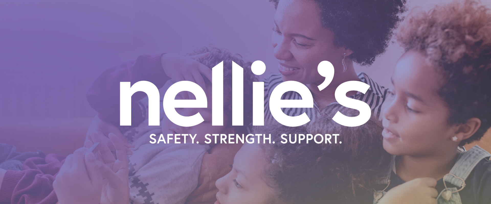
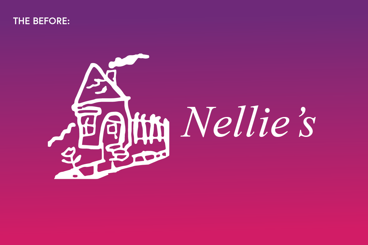
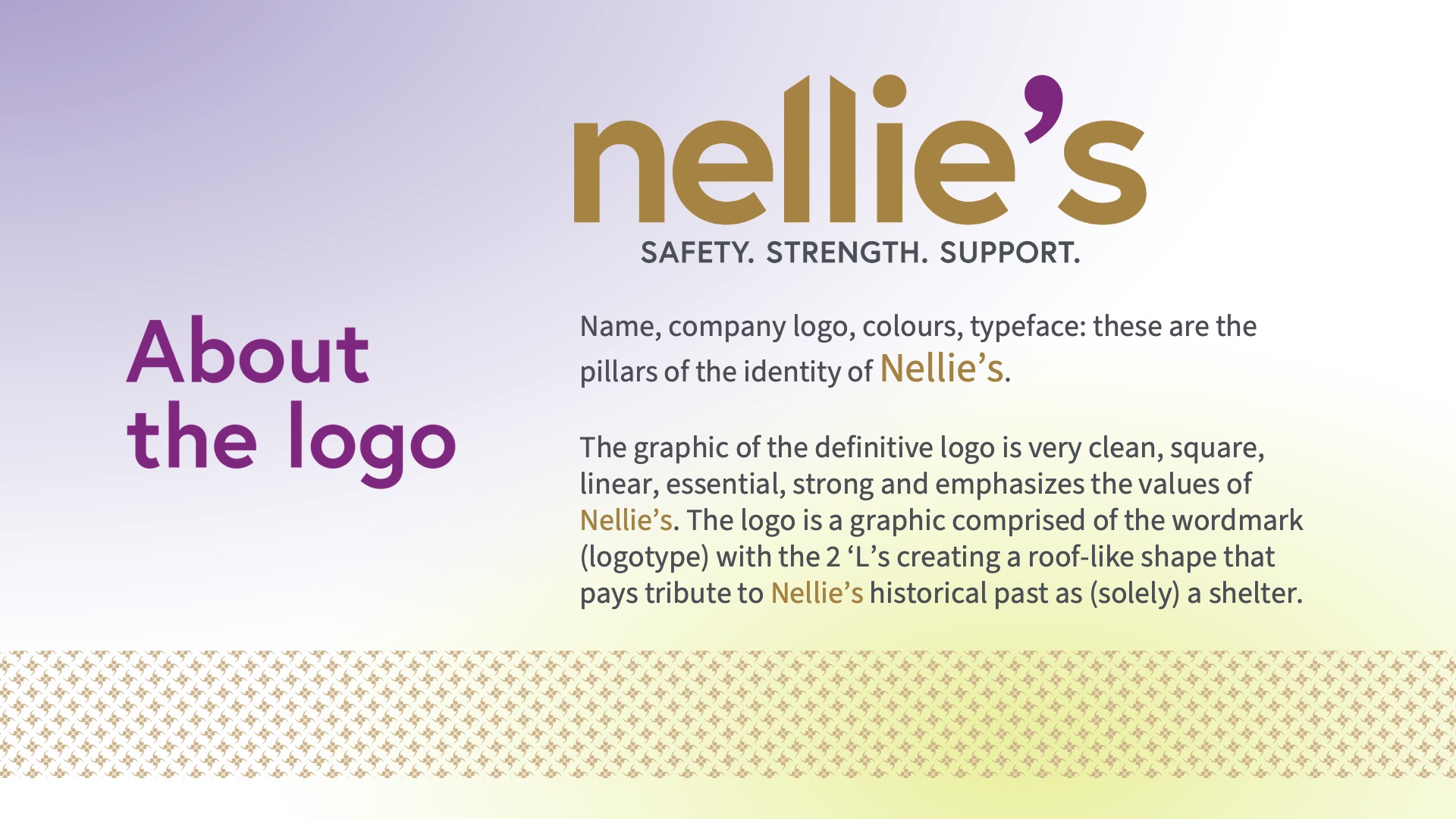
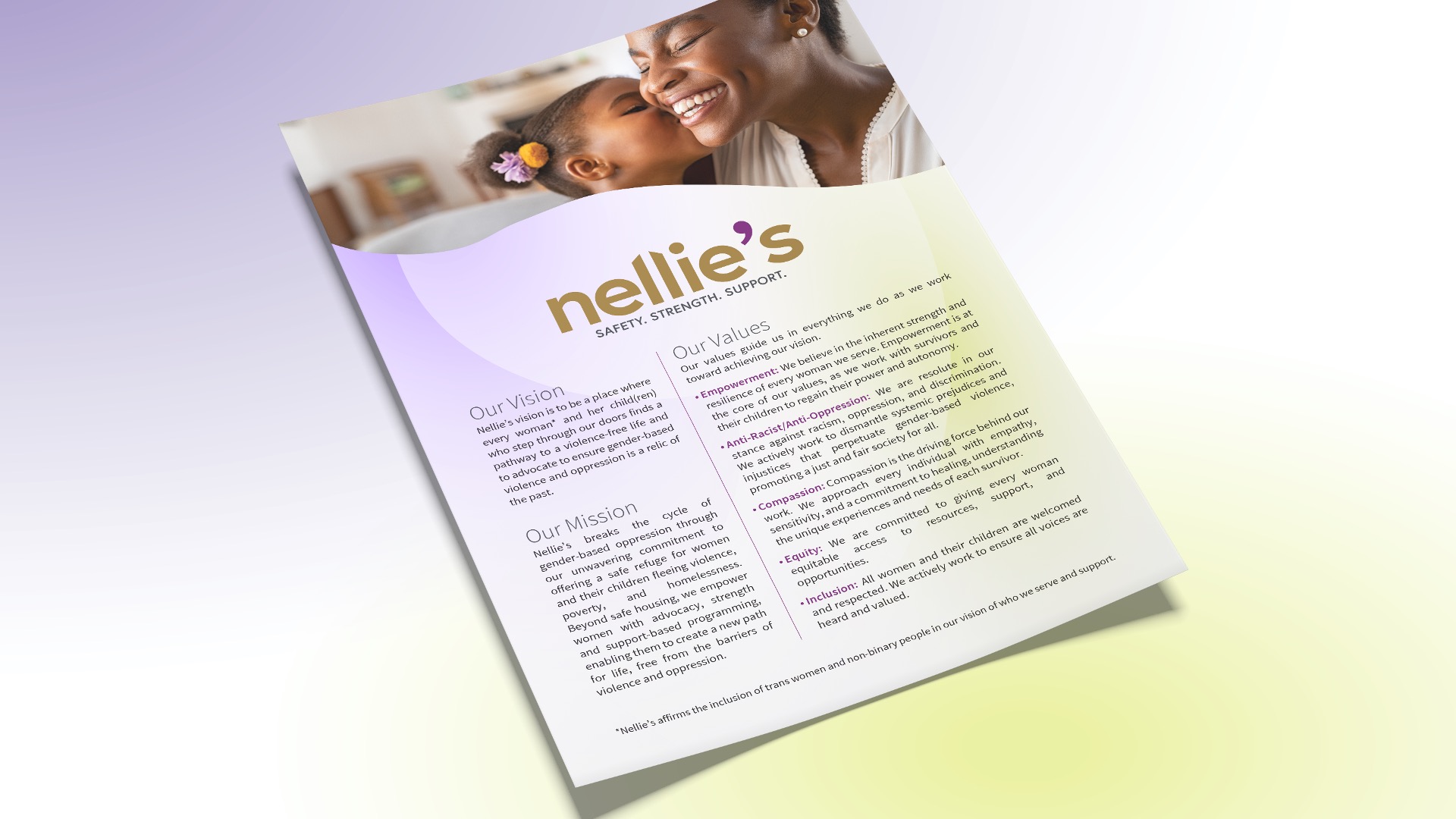
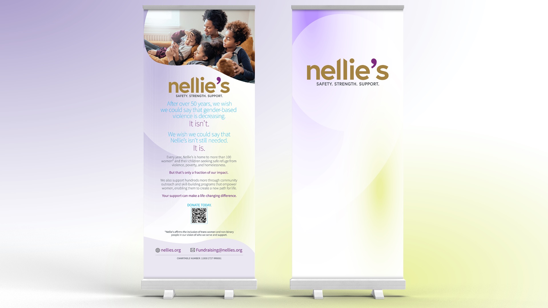
Nellie’s is a gender-based violence organization in Toronto. Since 1973, Nellie’s has been a place of respite and rejuvenation for women and their children fleeing violence, abuse, and homelessness. While they had long been known as a crisis organization, today they are much more. To better reflect all facets of the organization, including their work to break the cycle of violence, Nellie’s needed a new brand identity.
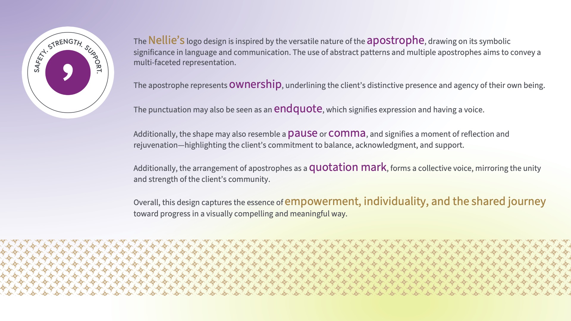
Following work done at the board level to update the organization’s messaging, mission, and vision, Luminate Communications and Varga Girl Design teamed up to conceive a logo design inspired by the versatile nature of the apostrophe, drawing on its symbolic significance in language and communications.
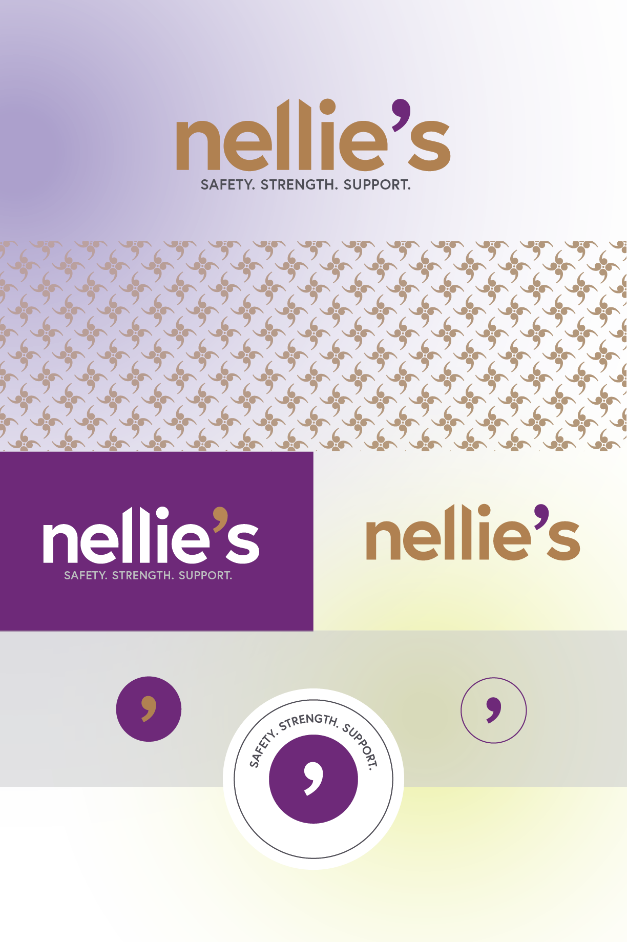
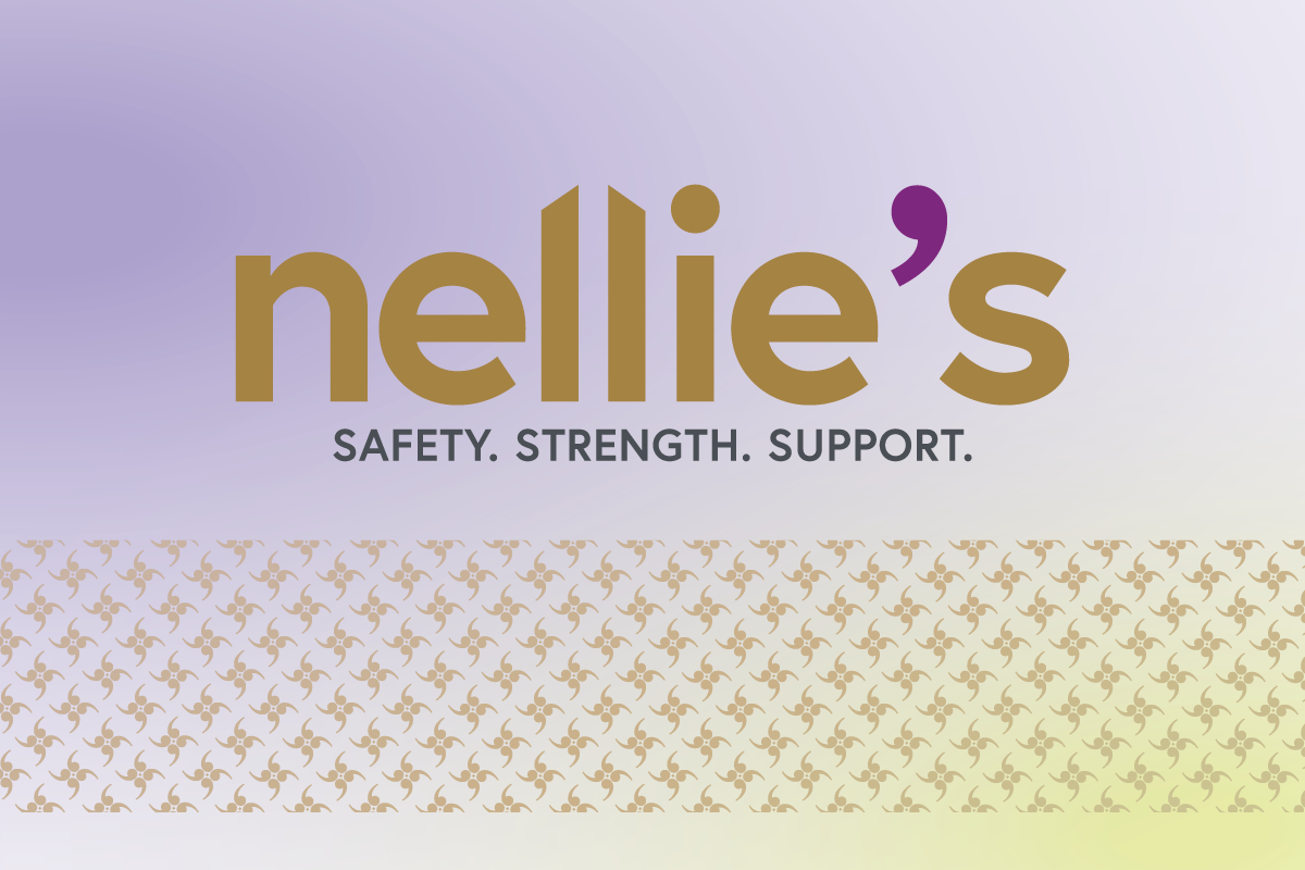
The logo itself is a graphic comprised of the wordmark with the two Ls creating a roof-like shape that pays tribute to Nellie’s historical past as (solely) a shelter. The apostrophe’s meaning is three-fold. It represents ownership, underlining the client’s distinct presence and agency of their own being. Additionally, it can be seen as an end quote, which signifies expression and having a voice; and it can also resemble a pause or comma, which signifies a moment of reflection and rejuvenation. A dramatic pattern was created from the apostrophe to further celebrate its significance.
Overall, this design captures the essence of empowerment, individuality, and the shared journey toward progress in a visually compelling and meaningful way.
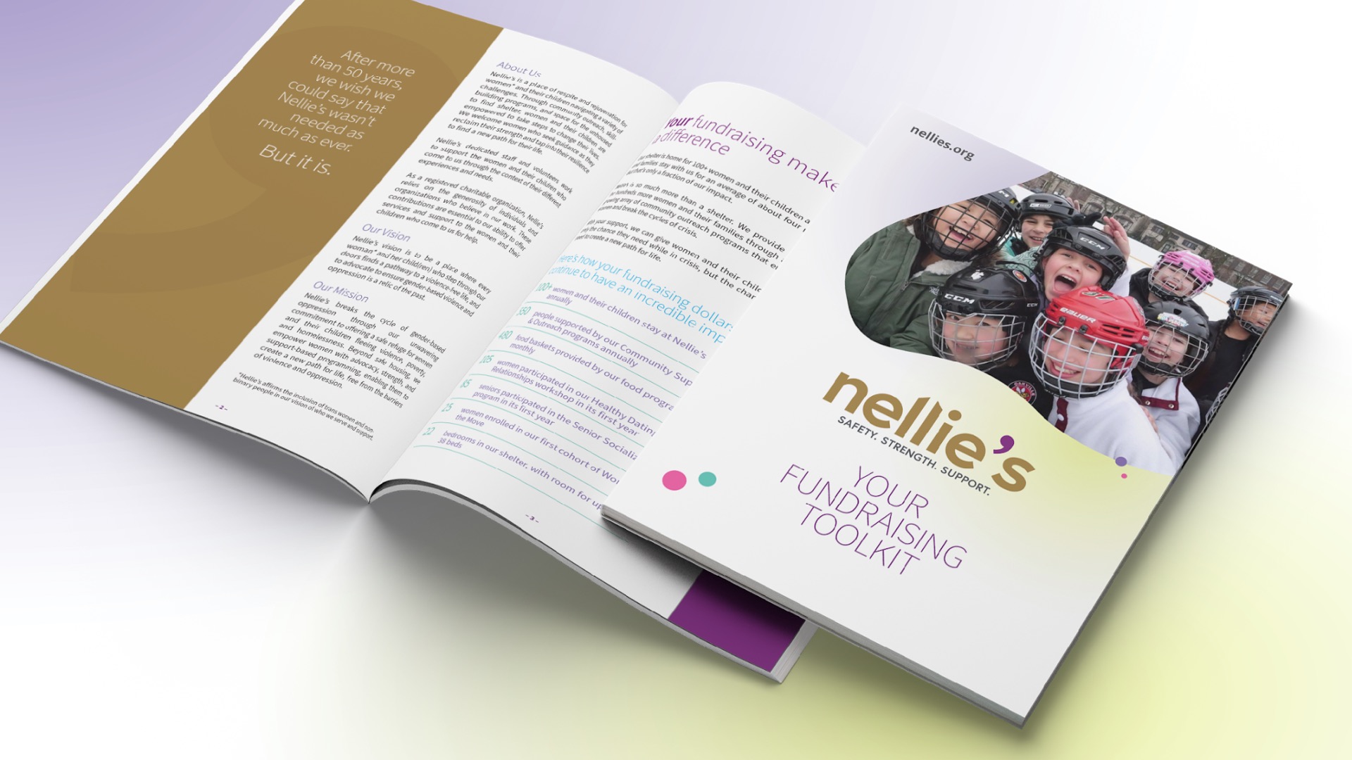
We then brought the brand to life by writing and/or revising and designing all of their marketing collateral, coded with a naming convention for easy management. This included reports, posters, fact sheets, banners, social media assets, email signatures, letterhead, business cards, swag, tax receipts, and more. We also reproduced many of the pieces in French. Once completed, we organized everything in a specifically-created content drive and created a PowerPoint presentation to introduce the rebranded Nellie’s to staff.
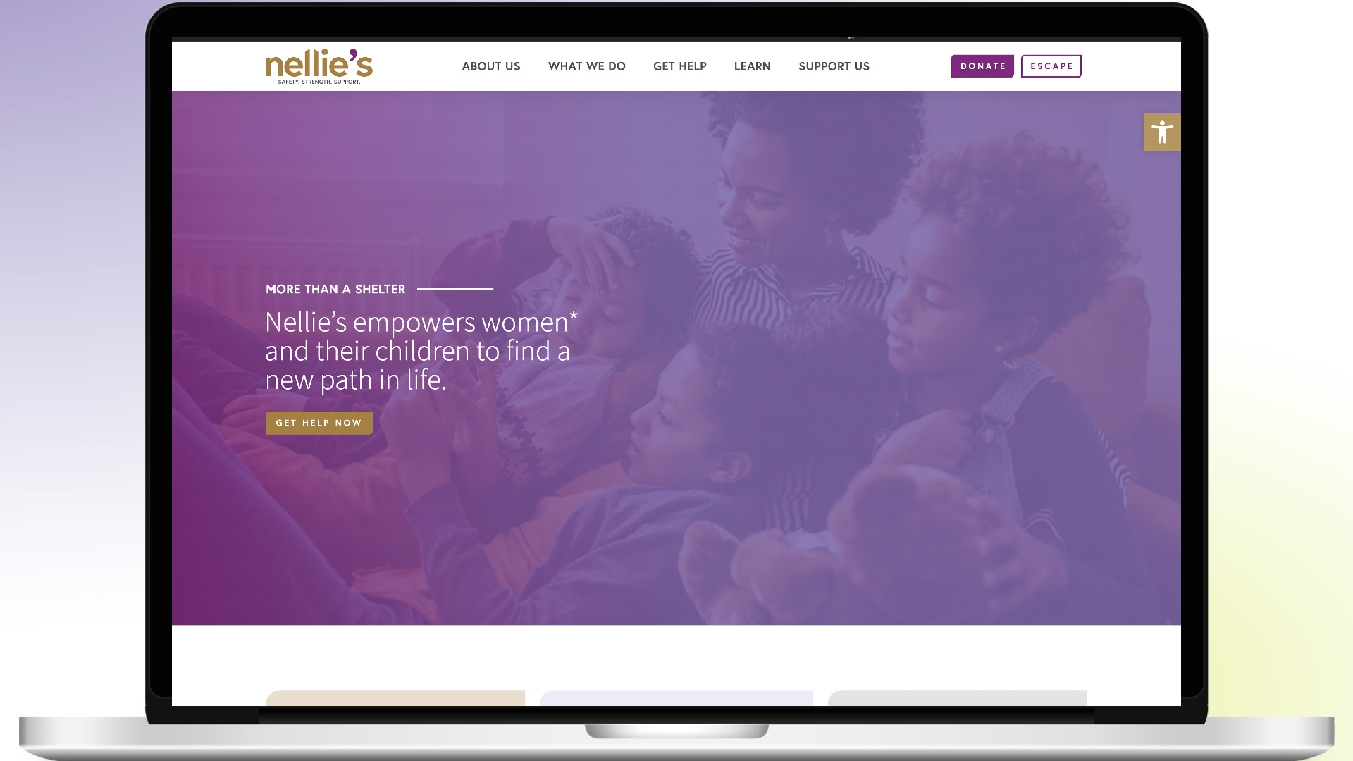
Simultaneously, we redesigned and rewrote the website to create an emotional connection between the audience(s) and the organization.
The results were a true reflection of the new vision for the future, enabling Nellie's to increase awareness and grow their fundraising.
Credits